
Patterns · 9 MIN READ
Funny cross stitch patterns: plan an original stitched message
Create an original stitched message with readable lettering, thoughtful line breaks and a small motif that supports the joke.
Start with a joke that belongs in the finished object
Funny cross stitch patterns combine two different tasks: creating a message that makes sense to its audience and turning that message into a readable counted chart. A phrase that works in conversation may become awkward when stitched across four cramped lines. Begin with the idea and the person who will see it, then shape the wording around the size and purpose of the object.
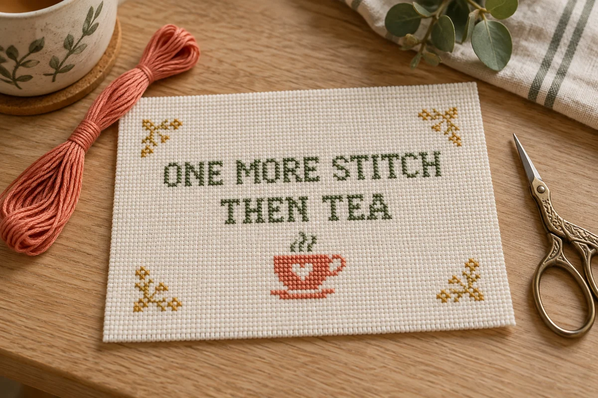
For a personal worktable sign, you could invent a gentle message such as "One more stitch, then tea." It connects the humor with the craft and can stand alone without a long explanation. For a kitchen piece, an original line about the household's habits may feel more personal than a joke copied from a popular image. Keep a list of your own short ideas, then choose the one that still makes sense after you remove unnecessary words.
Consider where the piece will be displayed. A private sewing corner, a family living room, and a shared office have different audiences. Choose the tone deliberately and check whether the intended recipient enjoys that kind of humor. A stitched gift is an object someone may keep for years, so a brief joke tied to a temporary disagreement can age less gracefully than a light observation about a familiar hobby or routine.
Test the wording before charting
Write the phrase on plain paper and read it aloud. Ask whether the meaning depends on emphasis that the viewer will not hear. Check whether a pause or line break changes the joke. You do not need a survey for every small project, but a trusted reader can help identify an ambiguous phrase. Correct the wording now; changing a chart is easier than removing an entire stitched line.
Keep the message original and the context clear
Develop wording from your own experiences and observations. An everyday idea can become distinctive through the way you express it, the motif you pair with it, and the recipient's connection to the subject. You might make a gentle sign about unfinished sewing projects, a preference for tea breaks, or the household cat's apparent ownership of the sofa. Aim for a message that feels complete without relying on a recognizable character or brand.
Check the source when a phrase comes from elsewhere. Buying a chart, finding a meme, or seeing a quote on social media does not automatically grant permission to reproduce or distribute the design. The rules can depend on the wording, artwork, license, and intended use. Use your own phrasing when practical, and follow the terms attached to any pattern or reference you choose. Do not treat a familiar sentence as proof that every illustrated version is freely reusable.
Keep a note of the chart's origin and your own changes. If you adapt a purchased design for personal use within its terms, identify the original in your private project record. If you plan to publish a chart you created, keep the artwork and layout original as well as the message. A new sentence placed inside someone else's copied border is still not a fully original composition.
Measure the lettering before choosing the frame
Count the letters, spaces, and punctuation in the chosen phrase, but do not assume all characters occupy the same width. In a proportional stitched alphabet, an I can be much narrower than an M. Chart the actual words before calculating the complete line length. Add the spaces between characters and words according to the alphabet's structure, then include the margin around the text.
Use the name and alphabet maker to explore a short line and compare its dimensions. For a longer message, make a separate paper or digital layout so you can test multiple lines. The alphabet spacing guide explains why the visual gap between letters matters as much as a fixed count. A mathematically even arrangement can still look uneven around narrow characters and punctuation.
Decide the physical size only after the stitch dimensions are known. A line 84 stitches wide measures six inches across at 14 stitches per inch. That is the width of the embroidery, not the fabric cut or the frame's outer edge. Use the fabric calculator and compare the result with the actual opening of the planned mount or frame. Leave enough cloth outside the design for handling and finishing.
Compare two lettering styles
Try a plain block alphabet and a more decorative alphabet on the same short phrase. Look at the words at their intended finished size. The decorative version may be attractive but less readable, particularly in a small chart. The lettering's job is to deliver the message, so choose clarity when flourishes compete with the joke. You can add personality through a modest border or a small original motif instead.
Use line breaks to support the timing of the joke
A line break can create a pause, but it can also separate words that need to stay together. Write two or three possible arrangements before choosing one. Keep the setup and the final turn of the phrase understandable. If the last word supplies the humor, give it enough room to read clearly rather than squeezing it into a narrow gap at the bottom.
Center each line by its actual charted width. Do not center only by the number of letters, because different characters and spaces can create very different spans. Mark the midpoint of each line and compare it with the design's vertical center. For an intentionally left-aligned composition, establish one clean starting edge. Consistent alignment helps the viewer understand a multi-line phrase without feeling that the words drift across the fabric.
Check the gap between lines separately from the gap between letters. Letters with descenders, decorative loops, or punctuation may extend into that space. If two lines nearly touch, increase the gap or simplify the alphabet. Draw the entire arrangement on cross stitch graph paper before stitching. This makes collisions visible and prevents the final line from unexpectedly extending beyond the working area.
Add a motif that strengthens the message
Pair the wording with one clear original motif. A tea cup can support a joke about breaks, a needle and thread can support a sewing observation, and a simple cat silhouette can suit a household message. Keep the motif small enough that the words remain the main focus. If the picture needs its own complicated explanation, it may distract from the message instead of helping it.
Use the motif to balance the composition rather than filling every empty square. A small image below the final line can give the piece a stable base. Two modest corner elements can frame the words without creating a heavy border. Compare the layout with and without the picture. If the message already feels balanced, a single accent may be enough; a complete decorative scene is not required.
Consider how the motif and lettering share colors. One main text shade, one accent shade, and a green or neutral for the image can produce a coherent small piece. Too many unrelated colors may make the words harder to follow. Test the text color against the actual fabric, particularly if you want a pale or muted palette. Gentle colors can remain readable when their contrast is chosen deliberately.
Keep decorative details away from letters
Leave a visible gap between the motif and nearby punctuation or letter strokes. A leaf beside an apostrophe or a small star near a letter can accidentally look like part of the wording. View a reduced preview to catch these effects. Decorative elements should remain distinguishable from the text even when someone sees the piece briefly from across a room.
Review every character before stitching
Make a final text checklist that includes spelling, punctuation, capitalization, and line order. Compare the chart against the approved wording, character by character. Do not rely on reading the sentence normally; familiar phrases can make the brain skip over a missing letter. Count repeated letters and check that the chart includes each one. A second careful pass can prevent a small mistake that becomes conspicuous in a text-centered design.
Check the symbol key and stitch instructions as well. If lettering and background motifs use the same thread, make that relationship clear. If the alphabet uses backstitch or fractional stitches, confirm that you understand how they are represented. A chart that looks simple in a preview may include details that need a more careful technique. Choose a version that suits your current confidence or sample the unfamiliar feature first.
Start from a measured reference and mark progress as you work. The beginner cross stitch guide covers counting and the basic cross sequence. For text, count from a nearby confirmed letter or line reference before beginning the next word. A single misplaced space can shift everything that follows, so pause at the end of each word to compare the stitched width with the chart.
Plan a finish that lets the words stay readable
Consider the display distance and the object’s surroundings. A framed sign among many small decorations may need stronger lettering than a card viewed in the hand. Look at the stitched piece from its likely viewing distance before final mounting. If the message only reads when you stand extremely close, you may need a larger chart for the intended location rather than a more elaborate frame.
For a hoop finish, compare the text rectangle with the circular opening. A long first line and a short final line can create a top-heavy arrangement inside a circle. Adjust the chart before starting, or choose a rectangular frame if that better serves the design. For a card aperture, test the opening against a paper mock-up and allow for the fabric position behind it. Do not trim the cloth until the alignment is confirmed.
Use the framing guide for measured centering and support. Keep the final finish tidy enough that the wording remains the focus. A very busy mount or patterned backing visible through open fabric can compete with small letters. A plain surrounding surface often gives a lighthearted message room to read clearly and lets the stitched texture provide its own decoration.
Keep a reusable record without making every gift identical
Save the final chart version with the exact phrase, stitch dimensions, fabric count, palette, and strand count. Record changes made while stitching so the file matches the completed object. If you corrected a spacing problem halfway through, update the chart before using it again. These notes help you produce a companion piece without accidentally repeating a mistake you already solved.
When adapting the idea for another recipient, revisit the wording rather than changing only a name. A joke that suits one person's worktable may not suit someone else's home. You can preserve the alphabet and general layout while making the message specific to the new context. Recheck the line widths each time, since even a short replacement word can change the entire composition.
A successful humorous stitched message is easy to read, appropriate for its audience, and pleasant to live with. Its humor can be quiet: one recognizable observation, one clear phrase, and a modest original motif. Give the lettering as much care as the idea itself. That combination produces an object whose meaning arrives naturally instead of making the viewer work to untangle crowded words or confusing decoration.
Choose an original chart from our free collection, or check your fabric measurements before you begin.
Free cross stitch patterns · Fabric calculator