
Patterns · 8 MIN READ
Cross stitch letters: plan a name that fits
Count letter widths, spaces and lines before adding a name to your stitching.
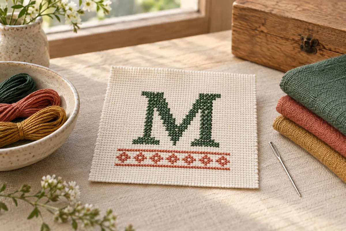
Plan the words before choosing the alphabet
A stitched name begins with the exact text, the object it belongs on and the available space. Confirm spelling, initials, punctuation and any date with the person involved before making a final chart. A single wrong letter can be difficult to repair once a border or finish is built around it. Write the approved text in your project notes so later layout changes do not accidentally change the message.
Decide whether the lettering should be the main feature or a small addition to another motif. A name across a framed sampler may need a different scale from an initial on a bookmark. Small block letters are easy to count, while an ornate alphabet can require more chart space and additional stitch types. Choose the style for its readability at the planned size, not merely for the appearance of a large digital sample.
Our name and alphabet maker creates simple uppercase block lettering using full crosses. It supports A–Z, numbers, spaces and the punctuation ! ? . -. The input accepts up to twenty-four characters and offers one, two or three squares of letter spacing. Check the supported characters before relying on the tool for a name with accents or another writing system; do not silently replace a person's name with an inaccurate spelling.
Read an alphabet as counted shapes
A cross stitch alphabet assigns filled and empty squares to each letter. Each filled square becomes a cross, and the spaces around it remain fabric unless the design says otherwise. You copy the shape by counting positions rather than by drawing a letter freely with the needle. A readable chart makes it clear where a vertical stem, crossbar or curve begins and ends.
Check that letters which look similar remain distinct. An O and a zero, or an I and a one, may have different forms in the chosen alphabet. Inspect them within the actual name or date rather than judging each letter in isolation. A digit in a date can be more confusing when its surrounding numbers use the same narrow strokes.
The maker uses a compact five-column, seven-row letter structure, with blank chart space around the line. This is a small pixel-style alphabet rather than a scalable handwriting font. Increasing fabric count makes those letters physically smaller; it does not add detail to their shapes. If you need larger or more decorative letters, use a suitable larger chart or draw a new original alphabet deliberately on the blank grid designer.
Test the complete phrase at its intended scale
Look at the entire phrase from a normal viewing distance. A letter that is recognizable alone can merge visually with its neighbor when the spacing is tight or the thread contrast is weak. Print or display the chart at a comfortable reading size, then calculate the actual stitched dimensions. The chart's display size on a screen is not the physical size the letters will occupy on the fabric.
Calculate the width with spacing included
For a simple fixed-width alphabet, add the letter widths and the spaces between them. Three five-square letters with one square between adjacent letters occupy seventeen squares: fifteen for the letters and two for the gaps. The name maker also includes blank space around the line in the exported chart, so inspect its stated total dimensions instead of assuming that the filled letters touch the chart edges.
On 14-count Aida, a seventeen-square-wide occupied line is approximately 1.21 inches wide. A seven-square letter height is half an inch. Those are small letters, which may be suitable for a modest personalized detail but too small to dominate a large frame. Use the fabric calculator to convert the full chart dimensions and add the separate fabric allowance your finish needs.
A long name can become a wide strip even when the letter height stays the same. Compare one-square and two-square spacing before deciding to reduce the fabric count or abbreviate the text. Increasing spacing adds width without making the letters taller. If the available object is narrow, a vertically arranged monogram or another original layout may be more practical than forcing a long line into it.
Separate word spacing from letter spacing
A word space needs to be visible as a break between groups, while letter spacing keeps neighboring shapes from touching. In the maker, a space is a blank character position within the fixed-width layout. Preview the whole phrase after choosing the gap setting because the combined blank areas affect the rhythm. A message can look crowded within words and overly spread out between them if you change spacing without reviewing the result.
For a manually drawn alphabet, choose one spacing rule first and apply it consistently. Then inspect difficult pairs such as two broad letters or a narrow letter beside a wide one. An optical adjustment may improve appearance, but document it on the chart rather than improvising it during stitching. Otherwise, the centered phrase can end at a different position from the planned border.
If you want multiple lines, chart the complete arrangement before starting the fabric. The current name maker produces one line; you can export separate lines and plan their positions on graph paper or build an original layout in another suitable editor. Our graph paper generator supplies a blank numbered grid for that planning. Include the gap between lines in the overall height calculation.
Leave room for accents and decorations
An alphabet containing accented letters may need extra rows above the main letter height. A decorative underline or small heart also changes the occupied area. Treat these as real chart positions, not additions that will somehow fit later. If the chosen tool does not support a character, use an authorized chart that does or draw it carefully with the correct spelling and a clear grid.
Center the name within the design
Find the center of the entire lettering layout, including internal spaces. For an odd-width line, the center passes through a column; for an even-width line, it falls between columns. Compare that center with the chart or object's intended center. Do not automatically center the first letter on the fabric and then work rightward, which would leave the phrase shifted to one side.
When adding a name beneath a motif, measure the relationship between their occupied stitch areas. A narrow name can be centered under a wider flower, while a wider name may need the border to expand. Check both as one composition. The pattern design guide explains how overall stitch dimensions and blank space affect the finished layout.
Before the first stitch, verify the starting square in two directions from a known reference. For example, the first letter may begin a certain number of columns left of the center and several rows below a completed motif. Use the actual chart relationship rather than estimating by eye. A temporary verified grid can help on larger samplers, as described in the gridding guide.
Choose thread contrast and a suitable stitch method
Place the proposed thread against the fabric before choosing the final color. Pale lettering on a similar pale background may become difficult to read, especially at a compact seven-row height. A darker shade can make the letter edges clearer. The generic digital color in the maker is a visual reference; compare it with physical thread and record the material you actually select.
Follow the chart's strand instructions or test a small sample for an original design. More strands are not always the answer to weak contrast: a thick bundle can crowd small holes while the letter still blends into the background. Try suitable colors and comfortable coverage separately. The needle and thread guide explains testing those variables without changing the entire setup at once.
Keep the top diagonal of full crosses consistent across the letters and any surrounding motif. If you add backstitch lettering instead of full-cross block letters, use a chart that clearly defines line endpoints and thickness. The backstitch guide explains why a line alphabet is a different stitch plan from simply filling the same small squares.
Stitch with frequent letter checkpoints
Work from the final chart rather than switching between a preview, an old sketch and memory. Check each letter's stem and top row before building the rest of its shape. At the end of a letter, confirm the gap and the next starting position. A one-square spacing mistake can move every later letter, so it is worth catching before completing the full name.
If a letter is wrong, compare it with the approved text and chart before choosing a correction. An extra cross might change an E into a different shape, while a missing space can make two correct letters read as one. Remove only the affected thread paths when practical and protect neighboring stitches. Avoid adjusting later letters casually unless you have recalculated the complete layout and center.
Mark finished letters or sections on a working copy you are permitted to annotate. For a gift with a deadline, estimate the actual filled crosses and include preparation and finishing time. The time calculator uses your own rate; it does not know that a short name includes several separate thread starts or a careful decorative finish.
Check the export and finish the personalized piece
Download the actual PDF or SVG and open it before beginning the fabric. Confirm the phrase, chart dimensions, color key and any page joins. Keep an editable plan if you expect to change the design. A saved export is also a useful reference if you resume the project later or want to make a second copy with the same spacing.
Review the spelling again after the stitches are complete. Check both the original chart and the visible letters from a normal distance. Secure the thread endings, then follow the material care instructions for any cleaning or pressing needed. A short name can take little stitching time but still needs appropriate backing, margins or edge treatment to become a durable finished object.
For a framed sampler, the framing guide covers centering and support. For a narrow personalized gift, the bookmark and border guide helps plan proportions and edges. Keep the recipient's private details out of publicly shared project files unless they want those details shared. Good personalization combines accurate text, readable shapes and a finish planned around the complete layout.
Choose an original chart from our free collection, or check your fabric measurements before you begin.
Free cross stitch patterns · Fabric calculator