
Patterns · 9 MIN READ
Cute cross stitch patterns: keep small motifs clear
Build small original motifs with clear silhouettes, gentle colors and practical chart details for cards, gifts and framed pieces.
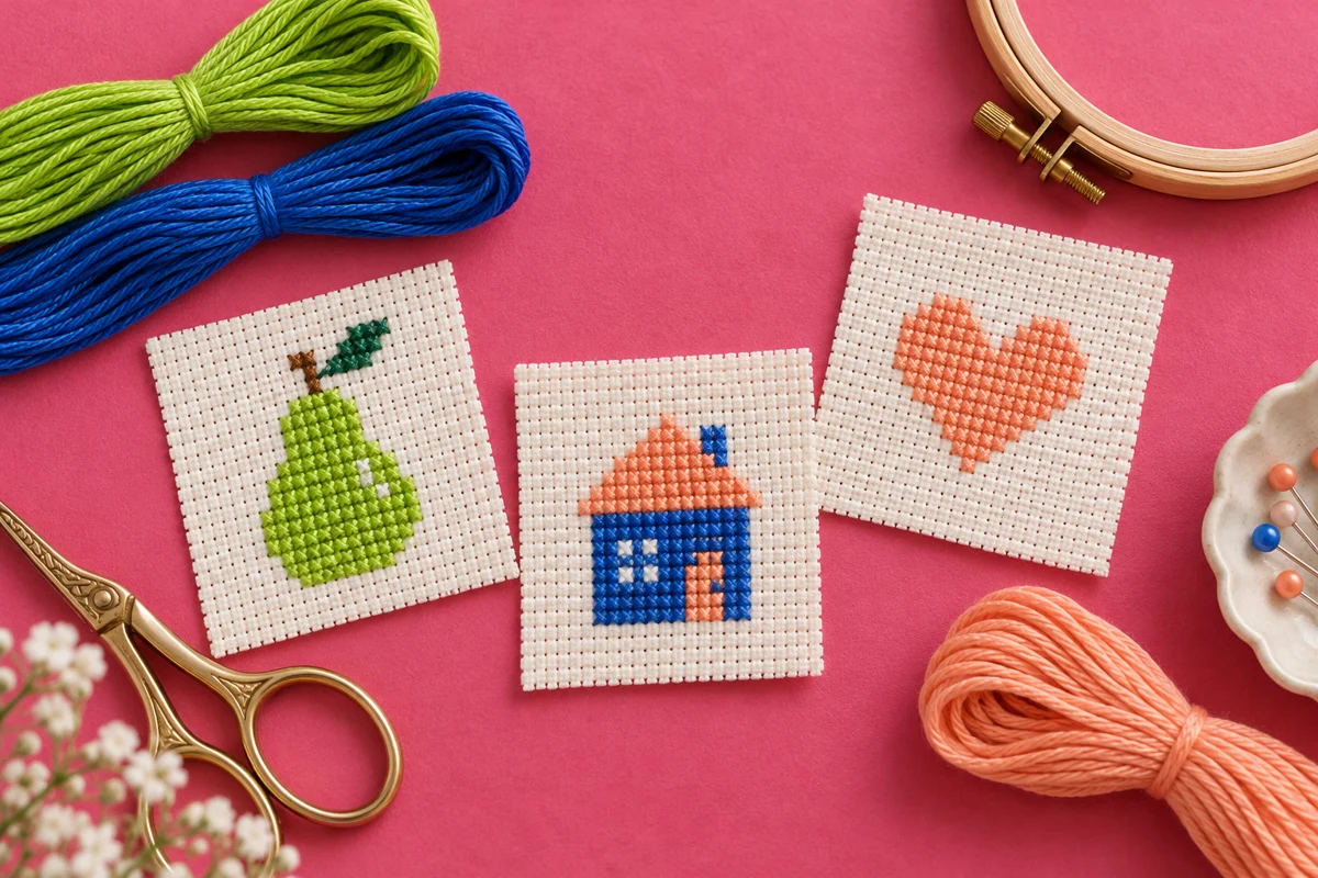
Define what makes a small motif appealing
Cute cross stitch patterns often rely on a few strong features: a rounded silhouette, a gentle color palette, a recognizable subject, and enough empty space for the design to breathe. Adding more detail does not automatically make a motif more appealing. In a small chart, every square has a visible role, so a simple shape that reads clearly can work better than a crowded miniature picture.
Start with a subject you can describe in one short sentence. It might be a pear with a small leaf, a sleeping generic cat, a little house with a warm window, or a cup beside a heart. Avoid beginning with an entire scene if you want a compact first project. Choose the central object, then decide which one or two details are necessary to recognize it. Extra decorations can come later if the chart has room.
Think about the object you will make as well as the subject. A tiny patch, a card insert, and a framed square have different boundaries. A motif that looks balanced by itself may sit awkwardly inside a narrow bookmark or a circular hoop. Sketch the finished object's outline first, then draw the embroidery within it. That makes the relationship between the stitched shape and the surrounding space visible from the beginning.
Choose your own visual vocabulary
Build appeal from ordinary shapes and original details rather than recognizable commercial characters. A pear can have a gently curved outline and one tilted leaf without imitating a branded illustration. A cat can be suggested by ears, a curled tail, and closed eyes while remaining your own design. Generic subjects still need original charting; another person's small chart does not become freely reusable simply because its subject is familiar.
Give the design a realistic grid budget
Choose a working rectangle before adding features. For example, a 24-by-24-square area gives you a compact space for one simple object and a small margin. It does not mean every square must be stitched. Draw the outer boundary, mark the center, and decide roughly how much of the area the object should occupy. If the first sketch already touches every edge, reduce the object or increase the grid before refining details.
Work out the physical size as well. At 14 stitches per inch, a design 28 stitches wide measures two inches across. The same stitch count on another effective count produces a different width. Use the fabric calculator when you compare options, and include additional fabric outside the embroidery for handling and finishing. A chart's compact stitched dimensions do not tell you how small to cut the cloth.
Keep the intended viewing distance in mind. A design on a greeting card may be viewed close up, while a wall piece may be seen from farther away. Features that are visible when you zoom into a digital chart may disappear at the finished size. Print or display a preview near its intended physical size, then step back. If the subject becomes unclear, simplify its shape before adding another thread color.
Set limits before drawing
Try a brief with one subject, no more than five thread colors, and mostly full crosses. Limits make choices easier to assess. If a feature requires several new colors or an unfamiliar stitch, ask whether it is central to the design. You can create a second, more detailed version later. Keeping the first chart controlled helps you understand which features actually contribute to the result.
Draw a silhouette that survives simplification
Outline the subject in one color before building shading. For a pear, make the lower half broader than the upper half, narrow toward the stem, and leave room for a leaf. For a small house, use a clear roof and wall shape before placing windows. For a curled animal, check that the outline communicates its pose without depending on tiny facial details. This silhouette test prevents decoration from hiding a weak basic shape.
Cross stitch curves are stepped. Look for a deliberate sequence of widening and narrowing rows rather than changing width randomly. Two rows of the same width followed by a small reduction can create a softer edge than narrowing every row by the same amount. Compare two versions of one side on blank graph paper. Choose the version that looks most coherent at the actual chart size.
Decide whether symmetry serves the subject. A heart or a formal little house may benefit from a mirrored structure. A fruit with a tilted leaf can look more natural with a controlled asymmetry. The key is intention. A nearly symmetrical motif with one unexplained misplaced square can look like a counting error. When symmetry matters, compare corresponding rows before beginning the final embroidery.
Select a palette with useful contrast
Give each color a clear job. One shade can define the main object, another can mark its shadow or edge, and a third can provide a small accent. The remaining colors might serve a stem, leaf, or simple background detail. If two shades appear almost identical on the chosen fabric, they may add thread changes without adding visible structure. Test them together before committing to the chart.
Soft colors can suit a gentle design, but pale does not have to mean indistinct. A light peach object on cream fabric may need a slightly stronger edge or a darker accent to remain readable. Conversely, a black outline around every feature may dominate a delicate palette. Compare a version with no outline, a selective outline, and a stronger main color. The best choice depends on the particular shape and background.
Use the image palette tool for inspiration from a photograph you own or are permitted to use. Treat screen shades as a starting point rather than an exact physical thread match. Place actual thread lengths on the fabric when possible. Record the selected shade identifiers and the symbols used for them, so an attractive digital idea becomes a chart you can follow consistently.
Check the background deliberately
The unstitched fabric is part of the palette. A cream background changes the effect of white petals, while a dark background changes the appearance of a thin dark stem. Consider the whole composition instead of choosing thread shades in isolation. If you change fabric color after completing the chart, review the important boundaries again. A feature that worked on the original background may need a different shade or arrangement.
Add expressions and accents sparingly
A small face can change the mood of an object, but the spacing of its features matters more than the number of details. Place the eyes on a temporary copy of the chart, then compare their distance from the center and the outer edges. Move them one square at a time and view the whole motif after each change. At miniature scale, a one-square shift can have a large effect.
Decide whether a mouth is necessary. Two simple closed eyes may already suggest a resting animal, while a tiny curved mouth could be difficult to render neatly in full crosses. You can use a little backstitch if it suits your skill and the pattern, but do not introduce it solely because the subject seems to require every possible facial feature. Clear silhouettes often communicate more than a crowded face.
Keep decorative accents connected to the main idea. A heart above a cup or one small flower beside a house can create a complete composition. Several floating stars, dots, flowers, and hearts may compete with the subject. Remove the accents and compare the design, then restore only those that improve its balance. Empty space can be a deliberate part of a cheerful, light design.
Make the chart easy to follow while stitching
Assign distinguishable symbols and include a clear key. A chart with five colors should still be readable when viewed without its color preview. Avoid symbols that differ only by a tiny mark if they are printed small. Use heavier grid references or numbering where helpful, and mark the chart center. These practical decisions matter even when the design looks simple and has few stitches.
Plan a starting point using a confirmed center or another measured reference. Work a manageable area and mark the chart as you finish it. Keep the top diagonals of the full crosses consistent. In a tiny shape, uneven direction can be particularly noticeable because the viewer sees nearly every stitch at once. The beginner guide explains the basic sequence if you need a refresher before starting.
Watch for isolated single stitches. They may be worthwhile for an eye or a highlight, but many scattered single stitches make thread handling more complicated. Examine whether an isolated stitch can join a nearby area without harming the shape. Do not force that change if it destroys an essential feature; instead, plan how you will start and end the short thread securely and keep the back manageable.
Sample the detail you are unsure about
Stitch a small test of the face, the pale edge, or the closest pair of colors on spare fabric of the same type. A sample can answer a specific question without requiring the whole project. Compare it at normal viewing distance, not only through a magnifier. If the detail disappears, change the chart or palette before working the final piece. Keep the sample and your notes together for reference.
Adapt the motif without losing its character
To create a matching set, vary one feature at a time. Three fruit motifs might share a palette and a general size while using different silhouettes. A group of little houses can share the same roof style while changing window placement. Keep an eye on the overall visual weight: a densely filled motif can look much heavier than an airy one even when their bounding rectangles are identical.
When making a card, test the embroidery against the actual opening before trimming the fabric. When making a hoop display, check the motif's visual center inside the circle. When adding a name, measure the lettering as its own element rather than squeezing it into the leftover space. The name maker can help you plan a short line, and the alphabet guide explains spacing decisions.
Choose a finish that suits use. An object handled frequently may need a backing and protected edges, while a decorative framed piece has different requirements. Raised beads or fragile details may not suit every small object. Think through the final construction before adding them. For flat display finishes, the framing guide discusses centering and support so that the small design sits neatly in its finished setting.
Review the design and keep it reproducible
Inspect the final chart in two ways. First, follow each row closely for stray squares, inconsistent symbols, and accidental gaps. Then reduce the preview and assess the whole silhouette, palette, and spacing. These checks reveal different issues. A perfectly counted chart can still feel unbalanced, and an attractive preview can hide a confusing symbol key. Give both the stitching instructions and the finished appearance attention.
Keep a record of the chart version, fabric count, strand count, thread choices, and any changes made during stitching. If you plan another matching motif, those notes will be more reliable than memory. Record the finished stitched dimensions as well as the planned ones. A small notebook entry or a project file can preserve the details without reproducing or publicly sharing a pattern whose terms do not permit that use.
Judge success by clarity and enjoyment rather than by the number of colors or techniques included. A small original motif can have character through one well-shaped outline, a thoughtful accent, and a palette that works with the cloth. Once that foundation is sound, you can explore variations. Keeping the first version readable gives you a useful design to finish, repeat, and develop into a collection of your own.
Choose an original chart from our free collection, or check your fabric measurements before you begin.
Free cross stitch patterns · Fabric calculator