
Patterns · 8 MIN READ
Modern cross stitch patterns: simplify shape, color and space
Create an original composition with clear geometric shapes, deliberate empty space and a palette that works on the chosen fabric.
Define the design through a few deliberate choices
Modern cross stitch patterns can explore geometric shapes, spare compositions, bold colors, or familiar subjects simplified into clear blocks. The term does not identify one fixed style or level of difficulty. Begin by describing what appeals to you in the design: a limited palette, a large area of unstitched fabric, an unusual arrangement, or a strong repeating shape. Those concrete features are easier to plan than a broad style label.
Choose the final object and its proportions first. A long horizontal panel can support a sequence of shapes, while a square may suit a single off-center motif. A circle introduces another boundary when displayed in a hoop. Sketch that boundary and the intended embroidery together. A design with substantial empty space still needs careful positioning so the blank area feels deliberate rather than like an unfinished section.
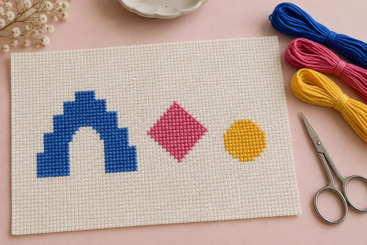
For an original first composition, try three shapes sharing a small palette. A stepped arch, a diamond, and a simple leaf can create variety without requiring many thread changes. Draw your own versions rather than copying a recognizable designer's arrangement. Ordinary geometric subjects are useful starting points, but another person's chart, layout, and illustrations still need their permitted uses checked before reproduction or distribution.
Write a visual rule for the project
Choose one rule such as three colors, mostly full crosses, and repeated widths. The rule should help you make decisions without forcing every shape to be identical. If a new motif introduces several unrelated shades or an entirely different level of detail, compare it with the rule before adding it. A coherent small collection often develops more clearly from a few related decisions than from many competing ideas.
Use the grid to refine shapes rather than hide it
Cross stitch translates outlines into stepped edges. Embrace that structure when drawing a curve or diagonal. Look at the rhythm of row lengths and the way each step changes the silhouette. A curve that narrows by the same amount in every row may look triangular, while a more deliberate sequence can suggest a rounded surface. Compare several versions at the same dimensions before choosing the final one.
Build the outline in a single color first. Check whether the shape remains readable without highlights, shadows, or a surrounding border. A strong silhouette gives the palette something useful to support. If the outline is unclear, extra colors may create visual noise instead of solving the problem. Use graph paper to compare shape variations and record their widths and heights.
Consider the connection between repeated shapes. If several motifs use a diagonal edge, decide whether its angle and stepping sequence should match across the composition. A consistent approach can create a shared visual language even when the subjects differ. An intentional variation can also work, but review it in the whole layout rather than treating each motif as an unrelated drawing.
Make unstitched space part of the composition
Blank fabric affects balance as much as thread. Give the main shapes room to be recognized and compare the gaps between them. Equal numerical spacing can be a useful starting point, but the visual weight of a broad block and a thin outline differs. Look at the complete design from a normal viewing distance and adjust gaps that feel crowded or disconnected.
Draw a boundary around the intended visible area, including the blank fabric you want to show. The embroidery's stitch rectangle and the finished display opening are related but different measurements. An off-center motif may require more visible space on one side, while a symmetrical arrangement may use matching margins. Test the planned placement inside a paper outline of the actual frame or hoop.
Remove a decorative element and compare the result before adding more. A small accent can connect two areas, but it can also interrupt a useful patch of empty fabric. The composition does not have to fill every square to feel complete. Ask what each element contributes: a focal point, a repeat, a color connection, or a clear balance against another shape.
Compare the design at two scales
Inspect the chart close up for individual square decisions, then view a reduced preview for the overall arrangement. The close view reveals awkward steps and stray stitches. The smaller view reveals balance, crowded spacing, and excessive detail. Both checks matter. A neat grid can still produce an unbalanced composition, and an attractive thumbnail can hide a difficult chart.
Choose a palette with clear relationships
Assign colors specific roles. One shade can anchor the design, another can provide a bright accent, and a third can link smaller details. You might compare cobalt blue, warm yellow, and pink against cream fabric, or choose teal, peach, and plum for a softer contrast. The useful question is how the shades interact in your actual layout, not whether each skein looks attractive by itself.
Compare thread on the intended cloth where possible. The background changes the effect of light and dark shades, and a screen preview does not guarantee an exact physical match. If two colors need to remain visibly distinct, test them in adjacent stitches rather than laying skeins far apart. A small sample can show whether the contrast is strong enough at the finished stitch scale.
Use the image palette tool to explore colors from a photograph you own or are permitted to use. Keep the resulting digital palette as a planning aid and record the physical thread shades you select. If changing a shade later, compare it against every neighboring color in the composition. A replacement that works beside blue may behave differently beside the pink accent.
Measure the chart and the display separately
Find the stitch width and height of the embroidery. Divide each by the effective stitches per inch to calculate its physical dimensions. A motif 70 stitches wide measures five inches at 14 stitches per inch. That width describes the embroidery, not the fabric cut or the visible blank space around it. Add the allowance needed for handling and finishing when planning the cloth.
Use the fabric calculator and fabric count converter to compare options. A change in effective count alters the physical size of every motif and every gap measured in chart squares. Check whether a slender outline or a tiny accent remains visible at the smaller size. Do not choose a finer scale only to make the chart fit a frame without reviewing those details.
For a display with deliberate asymmetry, measure the planned visible margins individually. A centered stitch rectangle may not produce the intended arrangement when the embroidery's darkest shape sits at one side. Use a paper mock-up and view it in the actual display position. This separates a deliberate off-center composition from an accidental mounting shift.
Keep the fabric margin generous until placement is confirmed
Do not trim close to the outermost stitch simply because the composition looks minimal. The finish may need additional cloth for mounting, backing, or sewing. Check the construction method before cutting, and test the final position first. Preserving that allowance lets you adjust the visible blank space without discovering that the fabric edge has already limited your options.
Turn the design into a chart you can follow
Use distinguishable symbols and a clear key, even for a palette of only three or four colors. A bold color preview can be easy to understand while the actual symbol chart remains difficult to read. Inspect the chart at the size you will use during stitching. Mark reference lines or the center where helpful, and make sure each symbol has one clear meaning within the design.
Look for isolated single stitches and decide whether they serve the composition. A few accents can be worthwhile, but a scattered field of unrelated squares creates frequent thread changes and starts. For your own design, consider joining or removing an unnecessary square when that improves the shape. Do not change a key feature simply to reduce effort; instead, plan its thread route deliberately.
The blank grid designer can help you draw and revise an original small motif. Keep versions of the chart so you can compare a change with the previous arrangement. Save the final palette and dimensions alongside the design. If you make a correction while stitching, update the chart afterward so the file records the completed version rather than an abandoned draft.
Stitch consistently and inspect long edges
Start from a measured reference and verify the first connected area against the chart. Keep the upper diagonals of full crosses consistent and the tension controlled. Large flat color areas can make changes in stitch direction or uneven tension more noticeable, so inspect them regularly. The beginner guide explains the basic movements if you need to refresh the sequence.
Check long horizontal, vertical, and stepped edges at useful stopping points. A single misplaced square can interrupt a clean geometric boundary. Count from a confirmed nearby feature rather than extending the next section from an uncertain edge. If the chart uses repeated blocks, compare their dimensions and spacing before moving on. Correcting one block early is easier than rebuilding an entire repeat.
Mark progress on a permitted working chart and note the active color when pausing. The project progress tracker can record totals and sessions, while detailed chart marks identify exactly what is complete. Keep the fabric clean and appropriately supported between sessions. A design with broad unstitched areas shows the cloth clearly, so thoughtful handling matters as much as the threadwork.
Sample an uncertain boundary first
If two adjoining colors seem too similar, or a narrow outline may disappear against the background, stitch that boundary on spare fabric of the same type. View the sample at normal distance. A few rows can answer a specific question without committing to the full chart. Make the palette or shape adjustment before starting the final piece when possible.
Finish with the same restraint as the design
Choose a finish that supports the composition rather than competing with it. A plain mount or frame can give a bold motif room to read, while a heavily patterned surrounding surface may distract from a sparse arrangement. Test the actual components with a paper mock-up or the completed cloth. The framing guide discusses support and positioning for a flat finished piece.
Inspect the chart for missing accents, incomplete edges, and accidental color changes before mounting or backing. Follow the care instructions for the fabric and thread if cleaning or pressing is required. Check the visual balance within the finish before trimming any remaining allowance. An original modern composition depends on its relationships, so preserve the planned gaps and proportions through this final stage.
Keep the chart, palette, fabric count, strand count, and final display measurements in your project record. Those details help you create a companion piece that shares its visual rules without repeating the same arrangement. A clear shape, a considered palette, and useful empty space provide a strong foundation. From there, you can develop another original design by changing one relationship at a time and keeping the decisions that made the first piece coherent.
Choose an original chart from our free collection, or check your fabric measurements before you begin.
Free cross stitch patterns · Fabric calculator